Rethinking how to communicate a product ecosystem
How we approached the redesign of Pulze’s website, from defining the right audience to structuring multiple products into a clear narrative.

Vitória Peres
Website
UX/UI Design
Interaction Design
I didn’t know Pulze before this project, they came to us through a recommendation from a previous client we had worked with, who was happy with our work and referred us.
And, in a way, the most demanding part came right at the beginning.
Before any layout work, there was a longer phase than usual spent trying to understand something fundamental:
- Who we were really speaking to , and how to speak to them.
At first, with my analise was to position the communication more towards archviz studios.
It felt like a logical starting point, considering the nature of the product.
But in one of our first meetings with the Pulze team, it became clear that the ambition was broader.
The product wasn’t just for that niche.
There was potential to reach freelancers, 3D artists, motion designers, and other types of creators.
That moment shifted the direction.
From then on, the challenge was no longer “how to communicate to a specific audience,”
but how to open the communication without losing clarity.
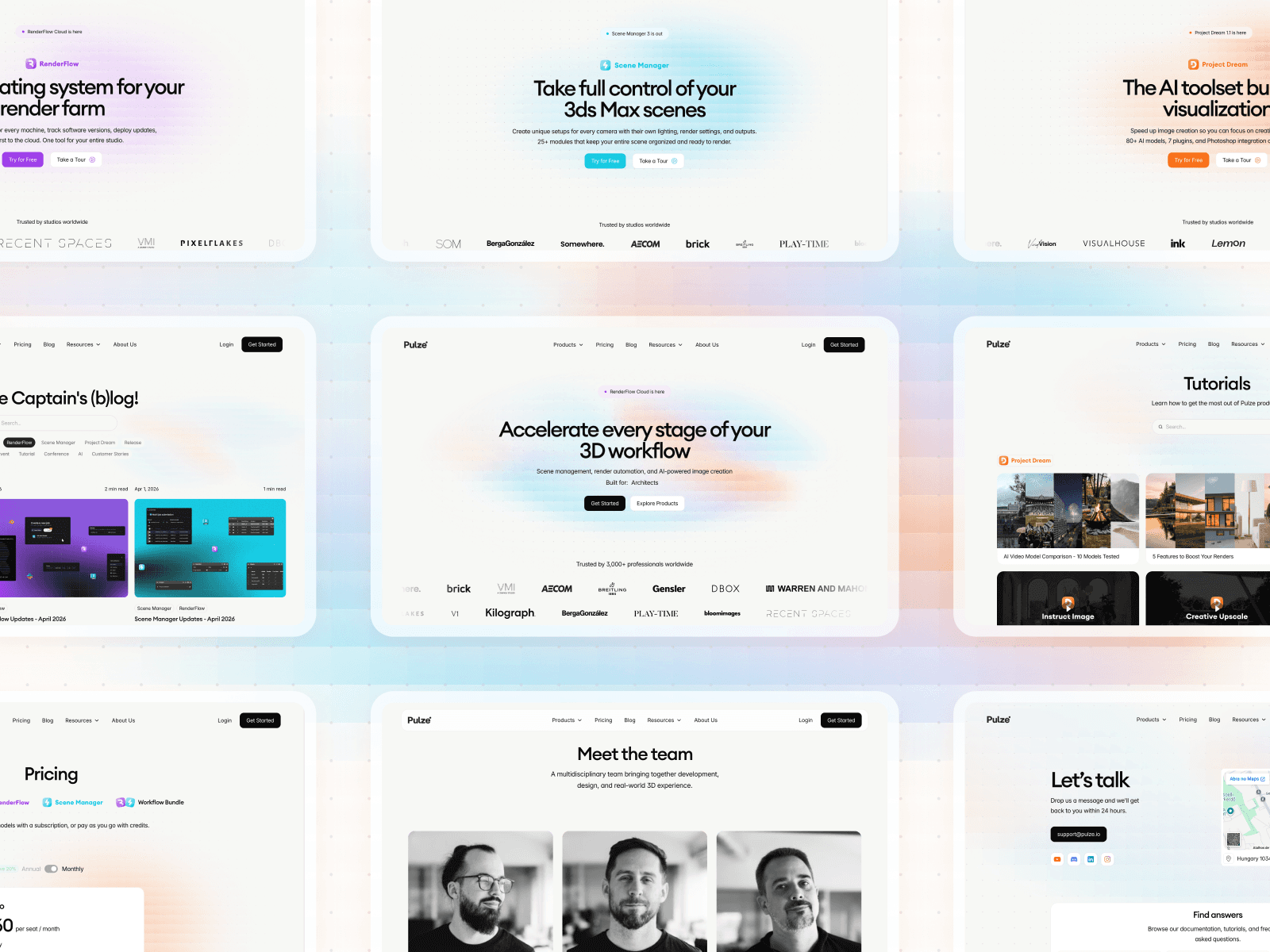
I remember when I shared the first version of the homepage.
More than a layout, it was a proposal for direction:
opening the communication to a broader audience
positioning Project Dream as the entry point
starting to frame the product as an ecosystem, rather than isolated tools
It was one of those moments where design isn’t just responding , it’s proposing.
Very quickly, I realized this wasn’t going to be a typical redesign.
Most of the time, the challenge is to simplify , to cut, reduce, and decide what to leave out.
This was different. Pulze isn’t a single product, it’s a system. RenderFlow, Scene Manager, Project Dream… each with its own logic, audience, and level of depth.
The challenge wasn’t just designing pages.
It was understanding how all of these pieces connect , and how that structure could make sense to someone seeing it for the first time.
What we were really designing
At first, the structure seemed straightforward:
Hero, problem, solution, features, integrations, social proof, CTA.
But it quickly became clear that structure alone wasn’t enough.
What was missing was clarity in how the story was being told.
Many of the decisions weren’t visual:
What is the entry point?
What does the user need to understand first?
When does something become too technical?
When is it not detailed enough?
There’s a point in projects like this where you stop designing UI ,
and start shaping how the product is understood.
Working with a team that knows what they’re building
If there’s one thing that stood out in this project, it was the Pulze team.
They were organized, responsive, and deeply involved throughout the process.
It wasn’t just feedback , it was structured thinking, clear documentation, references, and context.
That raised the level of the project.
It also raised the bar.
When the people on the other side have a strong vision, it pushes you to match it.
A lot of the clarity we achieved came from that collaboration.
Finding the balance
One of the hardest parts was not oversimplifying.
Pulze’s products have depth , and that’s where their value comes from.
But that same depth can overwhelm someone new.
The balance was always somewhere in between:
providing structure without limiting
explaining without overloading
simplifying without losing substance
And that balance doesn’t come from a single decision.
It comes from iteration.
The part that didn’t go as smoothly
The final phase was more challenging than expected.
As we got closer to delivery, several technical adjustments came up , mostly related to performance and behavior in code.
Nothing structural, but enough to require revisiting and refining things multiple times.
It’s the kind of phase that isn’t very visible, but has a direct impact on the final quality.
And where details really matter.
What stays with me
This project reinforced a simple idea:
Good design isn’t always about reducing complexity.
Sometimes it’s about holding it , and giving it structure.
And more than anything, it showed me the impact of working with a team that is aligned, involved, and open throughout the process.
That makes all the difference.
Ready to move faster without compromising quality?
We work with ambitious teams to design and build digital products — fast, in-house, and with measurable results.