Oyster Heaven
A cleaner, clearer website redesign for a mission that truly matters

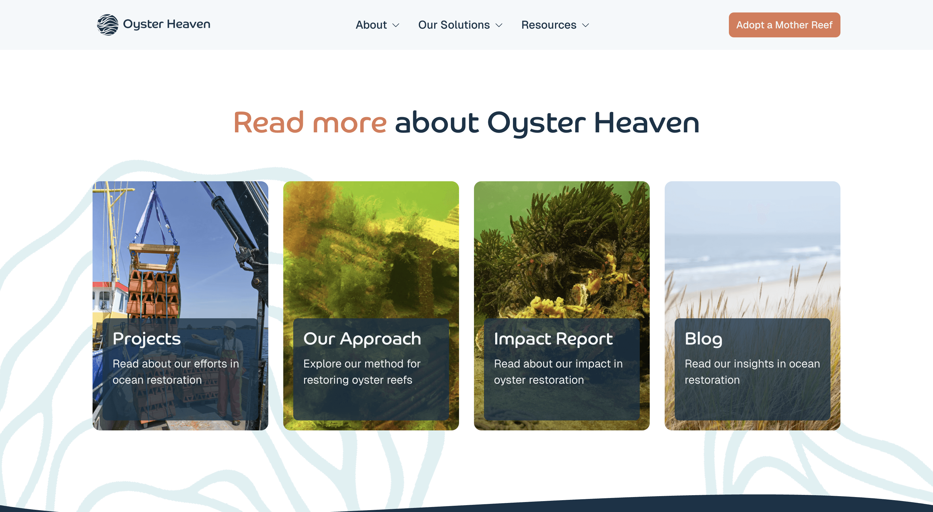
Oyster Heaven is a Netherlands-based organization with a remarkable mission: restoring ocean health. They needed a website that reflected this so we redesigned their online presence to be cleaner, clearer and built for company's independence.
Project Type
Marketing Website
Industry
Environmental Services
Services
Copywriting
Front-end Development
Motion Design
UX/UI Design
Timeline
March-April 2026
+0%
+0%
engagement rate
Concealed delivered a brand-new website structure and design that improved our engagement rate.

Veronika Labody
Marketing & Communications Lead
What wasn't working before
Oyster Heaven's impact is very real. Operating across seven countries with their own ocean restoration technology, the "Mother Reef", they had the mission, the results and the brand to back it up. What they didn't have was a website that showcased it accordingly.
The existing website was dense with information, inconsistent across pages and offered no clear path for visitors to understand what Oyster Heaven does or how to support it. And, for an organization asking people to invest in a transformation happening underwater, this gap mattered.
Our shared and clear goal
Oyster Heaven's team asked us to fully redesign their website to be cleaner and clearer, while building on the brand they had already established.
The team was really flexible and customer-oriented. They also thought outside the box and kept the UX design a priority. I don’t have anything for them to improve. Keep up the good work!
Veronika Labody
Marketing & Communications Lead
Framer over traditional development
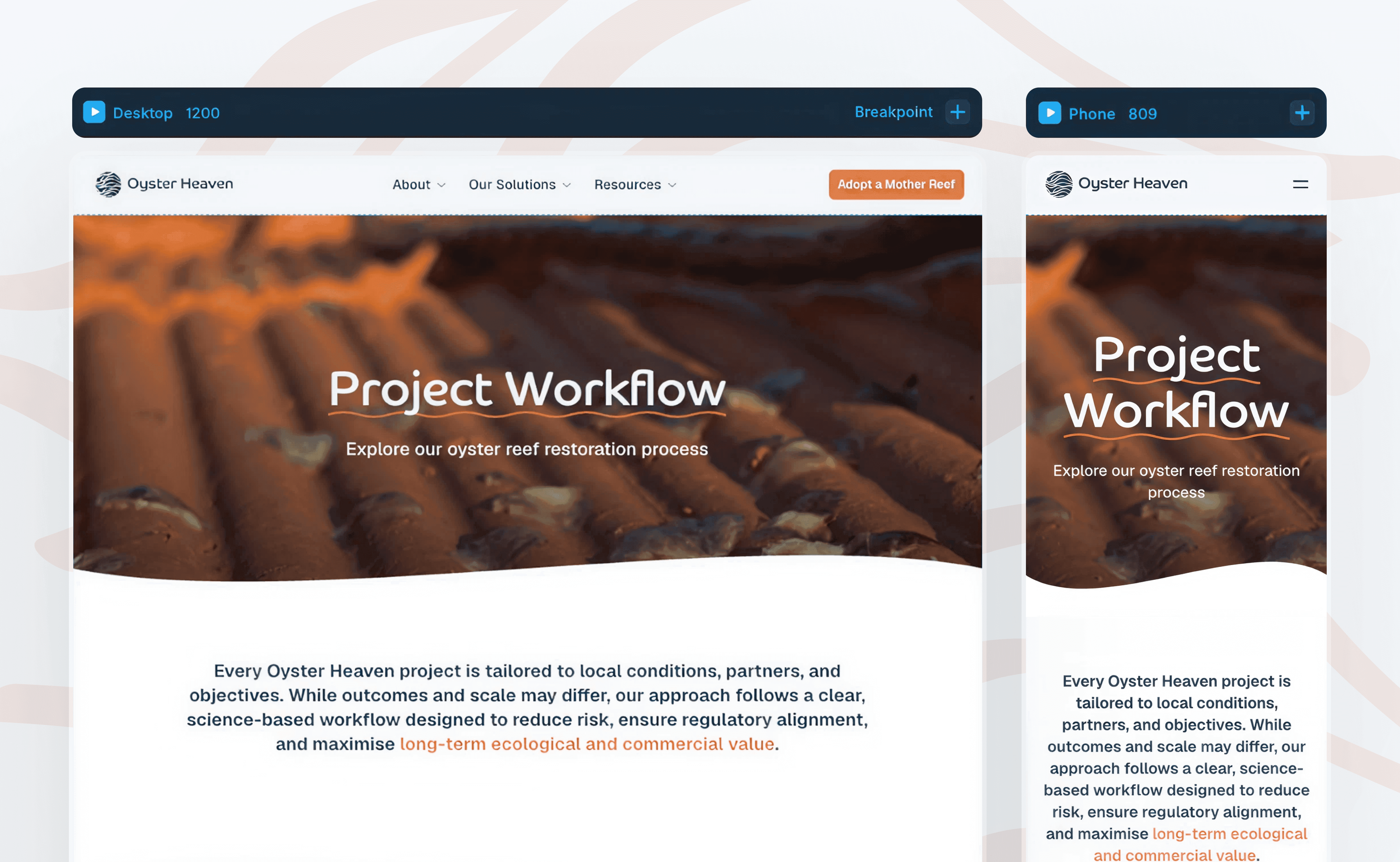
Oyster Heaven had a traditional design > development direction in mind, but we recommended Framer instead. Building in a traditional environment would have meant every future update required external help. Framer allowed the project to move significantly faster by combining design and development in one go, and, more importantly, left the Oyster Heaven's team fully prepared to tackle any changes they'd like to make autonomously after we provided some guidance on how to use the tool.
Simplicity over completeness
Oyster Heaven work is so rich, they had a lot to say: about the technology, the science, the impact, the process. Our job was to help them convey more while saying less. We restructured layouts, shortened copy and rebuilt sections page by page, always asking what a visitor needed to understand right now rather than everything they could possibly know at any time. This greatly improved readibility and ensured the design was tending to the users needs.


A narrative that moves people forward
Every page was designed with a clear next step. We introduced consistent CTAs throughout the site, built intentional internal linking across pages, and structured the information so visitors always knew what Oyster Heaven does and what they could do about it. A well-connected website is easier to navigate and works harder for SEO.

Where they are now
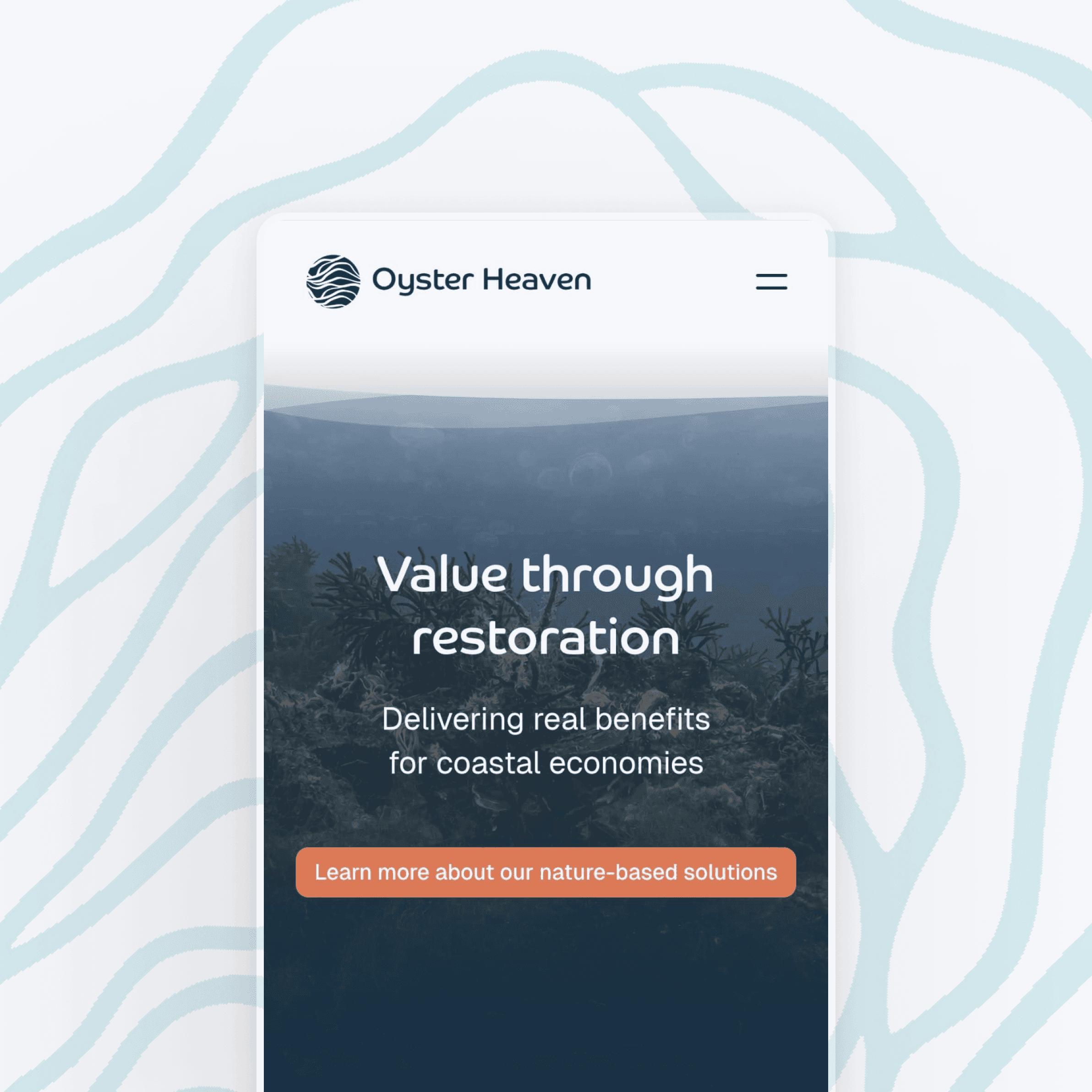
Oyster Heaven now has a cohesive, modern website across all pages that reflect the organization they've become. The mission lands quickly, the adoption flow is clear, and the team can manage it entirely on their own, supported by a comprehensive handover document in Google Docs and video walkthroughs made specifically for them, so no one is ever left guessing.